Magazine
Visuelles Erscheinungsbild Serve and Volley

The Humboldt Lab’s new website: Visual appearance as a formula

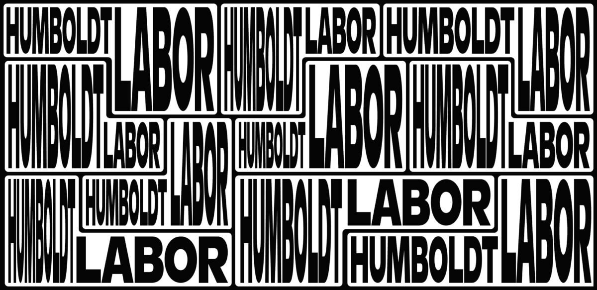
The Humboldt Lab combines science, exchange and the joy of experimentation – a concept that is aptly reflected in the lab’s new flexible visual identity. The special mixture of integration and independence led to the development of a visual design language that is both powerful and adaptable.

The Humboldt Lab is much more than a classic exhibition space – it is a living place of knowledge and science. Interdisciplinary formats are used to convey the significance of scientific findings and reinforce their relevance. The term “lab” in the name refers to an experimental, dynamic environment in which new ideas are developed, discussed and reflected upon. It is a space for dialog, research and teaching that is constantly evolving.

These fundamental principles already provide important clues for the visual design: openness, exchange, interdisciplinarity and flexibility. The visual language of the Humboldt Lab should reflect these values and convey a dynamic, changeable aesthetic.

The institutional context is equally formative. The Humboldt Lab is embedded in a multi-layered network: it is part of the Humboldt University, located at the Center for Cultural Technology and at the same time an active entity in the Humboldt Forum. These institutional relationships should be made visible in the new image. On the other hand, a central goal of the new visual identity is to strengthen the visibility of the Humboldt Lab and to clearly anchor its independence as an institution.

This gives rise to another key design principle: the corporate design should not only create recognizability, but also make the balance between institutional affiliation and individual identity visually tangible.

The aim is to create a concise, independent expression that adapts flexibly to different contexts without losing its characteristic features.

Environment

The Humboldt Lab operates within its institutional framework and at the same time moves in a field of tension between affiliation and independence. On the one hand, it is firmly integrated into existing structures; on the other, it strives to make its own identity visible and tangible.

The dichotomy of integration and independence led to the development of a visual language of form that is both powerful and adaptable.

Flexible structure

In the graphic derivation, this resulted in a flexible basic structure of modular forms that can blend harmoniously into existing environments or deliberately stand out depending on the context. This structure allows visual elements to be changed, expanded or transferred to new contexts depending on the situation, ensuring that the appearance always remains lively and changeable.

This dynamic system makes it possible to adapt visual components to specific requirements while maintaining a consistent, recognizable aesthetic.

Typography

The “Ginto” font from ABC Dinamo was chosen for the typographic design of the “Humboldt Lab” lettering. This font gives the appearance a clear, self-confident and at the same time contemporary look.

The logo

The logo is made up of the L-shape and the lettering. The flexibility of the L-shape gives rise to countless variations that can be adapted to suit the context and application. It can blend harmoniously into its surroundings, set specific accents or take center stage as an independent, striking element. This versatility gives the appearance a special dynamic and enables targeted communication depending on the situation and medium.

Colors

To underline the adaptive character of the visual appearance, there are no fixed guidelines for the color scheme. The logo is already expressive enough through its form and typography, so that color changes do not diminish the recognition value, but can even strengthen it. In addition, the color scheme in future exhibitions will be based on thematic references.

Only the black background is fixed – as a reference to the optimal presentation in a dark, spotlit room.

Design applications

The developed visual formula offers a wide range of design options and can be transferred to a wide variety of media and formats – whether digital or analog, moving or static. Thanks to the modular structure, the appearance always remains variable while retaining its characteristic visual DNA.

Three fictitious layouts that show how different formats and logo hierarchies can be handled.

The newly developed visual appearance reflects the Humboldt Lab’s self-image: a place that sees itself as an experimental, lively workshop of ideas – a platform for the exchange of knowledge, the promotion of new perspectives and the interdisciplinary networking of science and society.

A big thank you to the Humboldt Lab team, who, in line with the principles of the Lab, have embarked on this new path in dialog with us.

We are excited to see what will emerge – whether posters, brochures, T-shirts, flags, animations or web content … that’s the beauty of experimental visuals.

Serve and Volley
Klaus Neuburg and Simon Roth